
,
Absolute versus relative risk – making sense of media stories
,
|
This blog by Sarah Williams should help people who want to understand risk in the context of health and medical stories in the press.
Key Concepts addressed:Details
This great blog by Sarah Williams of Cancer Research UK is a must-read for anyone who wants to understand “risk” in the context of health and medical stories in the press.
The blog will be of particular interest to patients, students and members of the public who have no prior knowledge of health statistics.
Sarah makes liberal use of examples in covering:
- what “risk” means, and the various ways of expressing it
- the difference between absolute and relative risk
- common pitfalls in interpreting risk in health stories in the media.
As the blog is available under the Share-alike Creative Commons licence, we have reposted it here in its entirety. Please use the link above to visit the original blog so that Sarah gets the credit she deserves!
Absolute versus relative risk – making sense of media stories
Category: Science Blog March 15, 2013 Sarah Williams

What do these headlines have in common?
- “People who use sunbeds are 20% more likely to develop malignant melanoma”
- “CT scans in childhood can triple the chance of developing brain cancer”
- “One drink a day increases breast cancer risk by 5%”
They’re all statements of the relative risk of developing cancer. They tell us how much more, or less, likely the disease is in one group, compared to another.
But crucially, they don’t tell us anything about the overall likelihood of any of these things happening at all – what’s known as the absolute risk.
In this post we’ll explore the notion of risk, and some of the common pitfalls of taking headlines involving risk at face value.
What is risk?
Simply put, the ‘risk’ of something happening is its chance of taking place.
A quarter of the cards in a standard pack of playing cards are Hearts. So if you pick a card at random, the chance or ‘risk’ that it will be a Heart is one in four. But it’s also possible (in fact it’s more likely) that the card you pick won’t be a Heart.
That’s an important thing to remember about risk – it tells us about the chance of something happening, but it’s not a guarantee that it will.
But because risks tell us how many times an event would probably have happened, on average, out of all the chances it could have happened, there are lots of different ways of representing them.

Pick a card, any card
Pick a card, any card
For example, if something usually happens one time in every four – like drawing a Heart from a deck of cards – we can say it happens one in four times. But we can also say it happens ‘a quarter of the time’, or ‘25 per cent of the time’ (we’ll come to percentages later).
The Understanding Uncertainty website has a useful animation that shows there are a staggering 2,845 ways to talk about a risk.
Naturally, people can find this very confusing. For example, when comparing the following:
- one in 100
- one in 1,000
- one in 10
…you may think that the middle one – 1 in 1,000 – is the ‘biggest’ risk, since 1,000 is ‘bigger’ than the other numbers. In fact, when researchers asked people the same question they found that around a quarter of people didn’t answer correctly (the correct answer is, in fact, one in 10).
It’s even harder to compare something like ‘7 out of 35’ with a risk like ‘3 out of 10’ (3 out of 10 is bigger).
But it gets much easier to compare risks if they’re ‘out of’ the same number (technically known as having a ‘common denominator’). Taking the example above, 7 out of 35 is the same as 20 out of 100. And 3 out of 10 is the same as 30 out of 100. That makes it much easier to tell at a glance which risk is higher.
This is why people taking about risk often use percentages (although again, researchers have found that between a quarter and a fifth don’t understand these either). A percentage simply tells us the number of times something happens out of every 100 chances, and allows risks to be compared more easily. In this case, 20 per cent compared to 30 per cent.
Absolute versus relative risks
So, quick recap – risk is the chance of something happening, and as we’ve seen, there are different ways of describing a risk. They don’t change the actual risk itself, but different ways of describing the same risk can profoundly affect how we perceive it. But what about comparing risks?
The actual risk itself is often referred to as the absolute risk. And as we’ve seen, the higher the absolute risk is, the more likely it is that the something will happen – though it still isn’t guaranteed to take place.
Going back to our deck of cards, the absolute risk of picking any Heart is 25 per cent (so 25 in 100 or one in four). But the absolute risk of picking the Queen of Diamonds, as poker players may know, is much lower – it’s just one card among 52 – which works out as just under 2 per cent.
So we can say that the ‘risk’ of picking any Heart is over ten times greater than picking the Queen of Diamonds. We’ve just compared two risks and come up with a relative risk – a way of comparing risks, to find out how much more likely one is compared to the other.
Let’s step away from the world of cards and into a fictitious (but perhaps more relevant) example.
Time for another example

Loch Ness (monster not shown)
Shocking news from Scotland – Loch Ness Monsters that eat fishermen are ten times more likely to develop cancer than those that don’t!
But – assuming they read this headline – how worried should the monsters be by this news?
“Ten times more likely” is a relative risk. But 10 times what? To get a clear picture of the dangers of eating fishermen, we need to know the size of the two underlying (absolute) risks the headline compares – the likelihood of Loch Ness monsters getting cancer if they don’t eat fishermen, and the likelihood of cancer if they do.
It turns out that two out of every 100,000 monsters who refrain from eating fisherman develop cancer. That’s their absolute risk – 2 in 100,000 (or, if you prefer, 0.002 per cent).
And on average, 20 out of every 100,000 fisherman-eating monsters develop cancer (or 0.02 per cent). Comparing the two risks we can see that the risk for fisherman-eaters is indeed 10 times bigger, and this means that for every 100,000 monsters that eat fishermen, 18 more monsters will develop cancer.
Relative risk tells you nothing about actual risk
The size of the initial absolute risk is what’s really important here. If the initial risk is very small, even a huge increase may not make much absolute difference. But for a risk that is quite large already, smaller increases can still have a big impact.
Let’s go back to the real-world headlines we began with, to see how much difference this can make.
The headline finding of a study published in June 2012 was that having several CT scans as a child ‘could make you three times as likely to develop leukaemia or brain cancer as an adult’.
This sounds quite worrying (and we could make it sound even scarier still – another way of saying three times as likely is ‘a 200 per cent increased’ chance of cancer).
But digging a little deeper into the research, as much of the coverage sensibly did, showed that because the chances of developing these cancers are so small (0.4 per 10,000 children aged 0-9 develop brain tumours and 0.6 per 10,000 children aged 0-9 develop leukaemia), the increased risk would mean one additional case of brain cancer and one of leukaemia for every 10,000 children given the scans.

Alcohol is behind many more cancers than CT scans
But our second example, of research showing that women who have one alcoholic drink a day could increase their risk of breast cancer ‘by 5 per cent’, is perhaps more a cause for concern.
A 5 per cent increase in risk seems much smaller than the previous relative risk (a 200 per cent increase), but here’s a key point: breast cancer is a much more common disease than childhood brain cancer.
So even a five per cent increase makes an appreciable difference across a large population. In fact, we calculated it could mean an extra 60 women in every ten thousand who regularly have a drink a day would develop breast cancer (compare this with the one extra leukaemia case per 10,000 children scanned).
And many women drink alcohol regularly, but relatively few children have CT scans.
So alcohol is behind many more cases of cancer than CT scans.
And here’s a final example of the media’s much loved shocking-sounding increase in risk.
Recently, the Guardian looked at a “70% increase” in cancer among women after the Fukushima Daiichi nuclear disaster. This was actually drawn from statistics showing an increase in absolute risk from 0.77 per cent to 1.29 per cent (this is indeed a 70 per cent increase). But, as reported by the Wall Street Journal, the absolute increase is ‘tiny’ – about 0.5 per cent.
(It’s even more interesting that both newspapers actively changed the headlines on copy they’d received from other news agencies… but that’s a story for another day.)
Keeping a sense of proportion about risk
Only you can decide how much and what kinds of risk you’re happy to live with. Because after all, everything we do increases the risk of some kind of harm – whether that’s driving a car, bungee jumping, doing some DIY or taking the dog for a walk (the Health & Safety Executive have some examples on their website).
To make these kinds of decisions, people need to know what the risks really are, and how they compare to each other.
In terms of cancer, we think it’s vital to provide information about the risks of different cancers, and how people can reduce their risk. It’s not about blaming people, it’s about giving people the information they need to make their own choices.
So beware of headlines bearing relative risk – they’re often not what they seem. If you’re interested in knowing more about how to interpret cancer stories in the media, we’ve written about this here.
And we publish weekly news digests on this blog, where we unpick the latest headlines and the research behind them.
You may also like
Evidence Based Medicine Matters: Examples of where EBM has benefitted patients
Booklet containing 15 examples submitted by Royal Colleges where Evidence-Based Medicine has benefited clinical practice.
| 0 Comments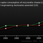
Association is not the same as causation. Let’s say that again: association is not the same as causation!
This article explains how to tell when correlation or association has been confused with causation.
| 0 CommentsBrowse Key Concepts
Back to LibraryJargon buster
About GET-IT
GET-IT provides plain language definitions of health research terms