3: Statistics are confusing – should patients really have to look at the numbers?
Download a pdf of Statistics are confusing – should patients really have to look at the numbers?
The way that numbers are presented can be very daunting – or even downright misleading. But if you really do want to compare one treatment with another, or to find out more about how the condition you have affects others like you, numbers always come into it somewhere. But some ways of presenting numbers are more helpful than others.
The best way to make the numbers mean something for lay people (and doctors too!) is to use frequencies. That means using whole numbers.So, saying 15 people out of a hundred is generally preferable to saying 15%.
Then it is often helpful to give the numbers not only in words but also in graphic form of some kind – for example, coloured bar charts; pie charts; pin men/ smiley and sad faces in boxes, etc; and also in tables. Presenting ‘numbers’ with these ‘decision aids’ means that as many people as possible can grasp what the data mean.

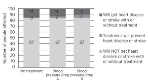
What will happen to 100 people like you in the next 10 years? (Click to enlarge)
Here is one way of explaining the effect of blood pressure drugs on the risk of heart disease and stroke in patients with high blood pressure over a period of ten years, using a bar chart. [3]
Out of 100 people with high blood pressure not taking any treatment, in the next ten years, 13 would be expected to get heart disease or have a stroke.
If all 100 people took blood pressure drug A, only 11 of them would get heart disease or have a stroke – and two of them would avoid getting heart disease or having a stroke.
If all 100 had taken blood pressure drug B, then ten would get heart disease or have a stroke and three would avoid getting heart disease or having a stroke.
That’s straightforward. Yet these simple numbers are often reported in terms only intelligible to statisticians.
Now let’s look at how the numbers work out using a table rather than a bar chart. In this example we will concentrate on the better treatment – drug B:
Let’s put the numbers into natural frequencies (simple counts) first, then work it through.
|
NO TREATMENT WITH DRUG B |
WITH DRUG B |
Heart disease or stroke
(over 10 years) |
13 out of 100 people |
10 out of 100 people |
| No heart disease or stroke |
87 out of 100 people |
90 out of 100 people |
| TOTAL |
100 |
100 |
With no treatment, the risk of heart disease or stroke is 13% (or 13 out of 100), whereas with drug B the risk is 10% (or 10 out of 100) – a difference of 3% (or 3 out of 100). Since drug B prevents 3 of the 13 instances of heart disease or stroke that would have occurred, that is a relative risk reduction of 3/13 or about 23%. So we can say there was a 3% absolute risk reduction with treatment, or a 23% relative risk reduction. These are two different ways of expressing the same thing.
Don’t be fooled by eye-catching statistics
 “Let’s say the risk of having a heart attack in your fifties is 50 per cent higher if you have a high cholesterol. That sounds pretty bad. Let’s say the extra risk of having a heart attack if you have a high cholesterol is only 2 per cent. That sounds OK to me. But they’re the same (hypothetical figures)”
Read more
The relative risk reduction is always a high number – and sometimes a lot higher – and therefore is more attention grabbing. So if you see a headline saying ‘23% of strokes avoided’ it tells you nothing – because it does not state the specific group of people affected, the timespan, or, most importantly, the risk of stroke without any treatment. It is most likely to be the relative risk reduction (but you need to check).
The numbers are sometimes very different. Consider the way a newspaper reported a study of prostate cancer screening. ‘Could cut deaths by 20%’ sounds large. The results could also have been expressed as one death prevented per 1,410 people screened (or a minuscule 0.07%, that is, seven premature deaths prevented per ten thousand men screened). The 20% is the relative risk reduction, the 0.07% the absolute risk reduction. The latter is much smaller, because of the low rate of death from prostate cancer – and unlikely to have grabbed the headlines. The bottom line is that if a headline claim sounds overly optimistic it probably is! [4]
So numbers do matter, and presented well can help people make decisions. Patients should not hesitate to ask their doctor to explain results in a way that they can readily understand – with visual materials for clarity as necessary. If decisions about treatments are to be shared, both doctors and patients need to be clear about what the numbers actually mean.


 “Let’s say the risk of having a heart attack in your fifties is 50 per cent higher if you have a high cholesterol. That sounds pretty bad. Let’s say the extra risk of having a heart attack if you have a high cholesterol is only 2 per cent. That sounds OK to me. But they’re the same (hypothetical figures)”